Echarts在线免费图表
地图工具
FlexBuilder
时间戳转换
WebSocket在线工具
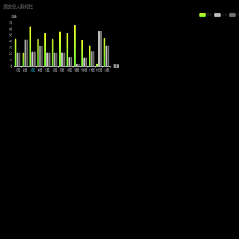
描述:当前是关于其它图表中示例。
格式化
运行代码
其它相关图表


![[横向条形图,Y轴,标题在左侧]营业总收入](https://www.mjrooo.com/assets/image-17334766686718.png)